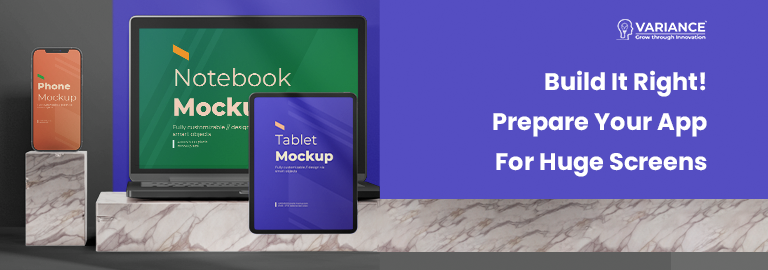
In today’s world, Android is installed on over a billion devices, and smartphones are just one component of this ecosystem. Android apps can be found running on a number of form factors, including tablets, foldable devices, laptops, and even desktop computers.
This post will teach you how to start using huge screens and why it’s so crucial: With new huge screen experiences, numerous form factors open up amazing new possibilities for your users. Accurately handling orientation changes, aspect ratios, and adaptive layouts may initially appear difficult.
We’ve split down the support for large screens on several levels since we know how difficult it is to support every size and how changing the way you think about adjusting your app for every screen can be. Your app can offer support at three different levels. The most fundamental one, Tier 3 — Large screen ready, calls for your software to function flawlessly in full-screen mode across all platforms. The next stage is to make your software suitable for huge screens. Your app must provide optimized layouts and improved external input support in Tier 2 — Large screen optimized. The highest support level comes last. Tier 1 — Large screen differentiated — demands that your software offers a completely unique experience on large screens.
| Tier | Definition |
| Tier 3 | Large screen ready |
| Tier 2 | Large screen Optimized |
| Tier 1 | Large screen differentiated |
This blog explains how to get started with Tier 3 and explains the value of optimizing your application for wide screens.
The initial step in optimizing your software for large screen devices is Tier 3. Use this guide to make sure your app satisfies all the criteria and that users can carry out crucial flows.
Settings and Continuity:
- The ability to handle configuration changes has always been crucial for Android app development, but large screen devices require it much more. Although users can always adjust the orientation, you should still be concerned about other configuration changes, such as the attachment of physical keyboards and the frequent resizing of windows on wide screens. It’s not a guarantee that your users will handle their devices in the same way they hold smartphones now that there are different form factors available. An app should not crash and should instead maintain its state throughout a configuration change, including scroll position and text entered into a text field. This is the first thing to keep in mind. Additionally, it is envisaged that after a configuration update, media playback will continue where it left off.
- This can be done in a variety of ways. A ViewModel is an excellent place to start, but other APIs can also be used to accomplish the task of maintaining state and pushing it down to the UI.
Multiple Windows and Resumes:
- The assumption that users will only have one app open at a time is challenged by a variety of form factors, including large screen devices. It’s wise to be ready because running alongside other programmes on big displays will increasingly be the standard for most apps.
- Multi-window presents new difficulties because you might need to review the lifecycle of your programme and look into any resource losses that may have occurred as a result, but it’s still a crucial step in the right direction.
Projection of Media and Camera Preview:
Source/Medium: https://medium.com/androiddevelopers/make-your-app-large-screen-ready-baf8fe505ae7
- Dealing with camera characteristics is unquestionably a crucial aspect of this journey, as well as likely one of the most difficult. This component can be used by users in any orientation, with any window size, and even in a foldable state. You might even consider utilizing unusual postures like tabletop mode or offering various experiences depending on aspects that we haven’t yet considered.
- To properly play video with the proper orientation and aspect ratio or to accurately display a camera preview is crucial for your users, and we can help! You can utilise CameraX if you don’t need to access the low level APIs and we recently published a new codelab to assist you handle resizable surfaces in your camera app. To get started, be sure to look at the Media Projection API tutorial and the codelab on ExoPlayer media streaming.
Trackpad, Keyboard, and Mouse:
- Consider how more alternatives are available to users than ever before thanks to huge screen form factors. For instance, many recent tablets include a keyboard and a trackpad, or users may choose to utilise an external Bluetooth keyboard in order to benefit from the larger screen. Your software must be able to transition between a virtual and physical keyboard without needing to restart.
- Not to be overlooked are keyboard and mouse navigation. Your users may be forced to utilise these gadgets as their sole means of input in the situations outlined above, such as on Chromebooks devoid of touch functionality.
A Conclusion:
Your preconceptions about app development could be challenged by the need to deliver a beautiful user experience across all platforms, but creating for large screen form factors presents a unique chance to make an app that is both more functional and accessible. To make sure you’re meeting all the requirements to make your app large screen ready and to prepare for the upcoming phase of your journey onto large displays.
Do You Need more information?
For any further information / query regarding Technology, please email us at info@varianceinfotech.in
OR call us on +1 630 534 0223 / +91-7016851729, Alternately you can request for information by filling up Contact Us
 Please wait...
Leave a Reply