1) Different List View compare between vTiger CRM 5.4.0 And vTiger CRM 6.0
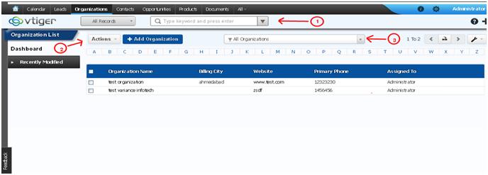
- vTiger 5.4.0 List View

- vTiger 6.0 List View

i) In vTiger CRM 6.0 Better UI then vTiger CRM 5.4.0.
ii) Maintain Unused Space.
iii) Left sidebar.
iv) Option For the recently created or changes Record Listening
v) Directly navigate the separate Modules dashboard view.
2) Different Create View compare between vTiger CRM 5.4.0 And vTiger CRM 6.0
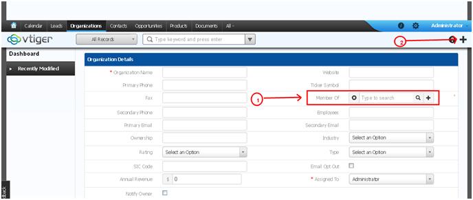
- vTiger 5.4.0 Create View

- vTiger 6.0 Create View

i) There is an option to search the name or Keywords.
ii) Text To Hint using Auto Suggest populated box.
iii) Also Default option to select the record from the popup windows.
3) Different Detail View compare between vTiger CRM 5.4.0 And vTiger CRM 6.0
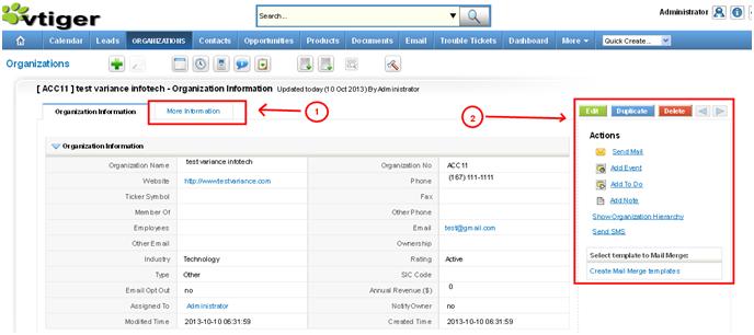
- vTiger 5.4.0 Detail View

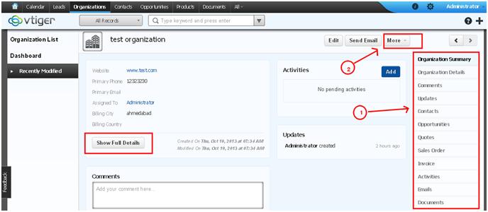
- vTiger 6.0 Detail View

i) in vTiger 6.0
- More Section Dropdown Functionality to manage the record.
- Right sidebar displays all modules to direct navigate the specific module home page.
- Initially display small information related to record.
- By pressing show full details get the whole detail of the record.
Do You Need more information?
For any further information / query regarding Technology, please email us at info@varianceinfotech.in
OR call us on +1 630 534 0223 / +91-7016851729, Alternately you can request for information by filling up Contact Us
 Please wait...
Comments (1)
Update vTiger CRM to Version 6.0 | MobiDartsays:
February 7, 2014 at 6:01 pm[…] notice that vTiger 6 is a heck of a lot different than vTiger 5.4…or earlier. Here is a a well-illustrated guide showing which features moved where. […]